
Customize basic settings, icons, delivery method styles, calendar, inputs, pickup locations, postal code widget, and advanced CSS.
Widget Design lets you style the storefront widget to match your brand. A live preview updates as you make changes.
Open Widget Design
From the app sidebar, click "Settings".
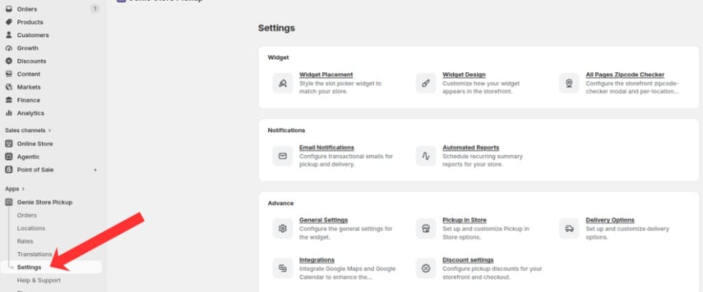
Open Settings from the app sidebar
On the Settings overview, open the Widget group and click "Widget Design".
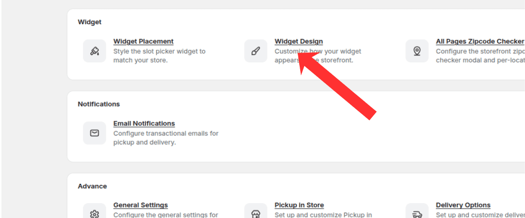
Open the Widget group and click Widget Design
Basic settings
Set the accent color, calendar week start day, and default delivery method shown when the widget loads.
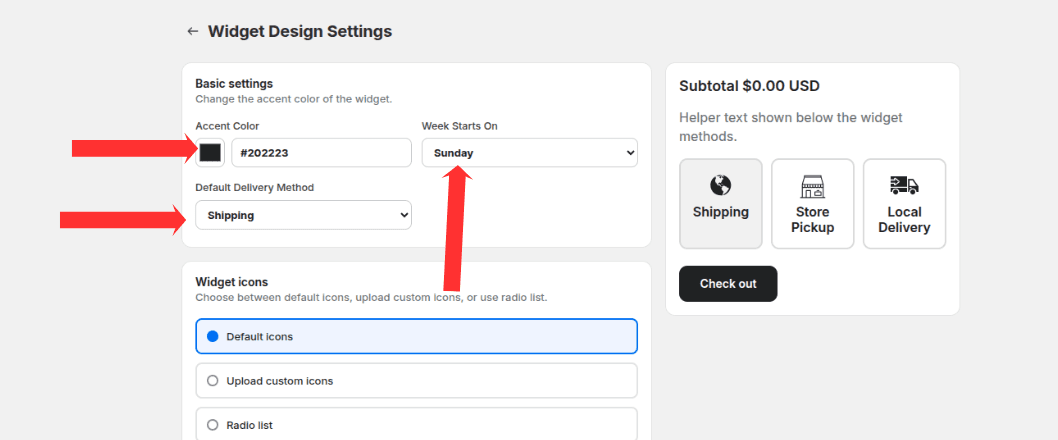
Set accent color, calendar week start day, and default delivery method
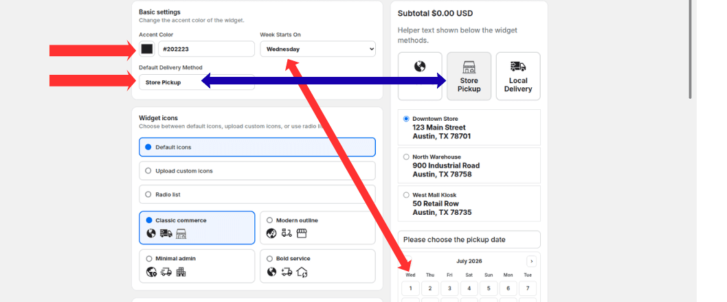
Week starts on updates the calendar; default delivery method selects the active tab on load
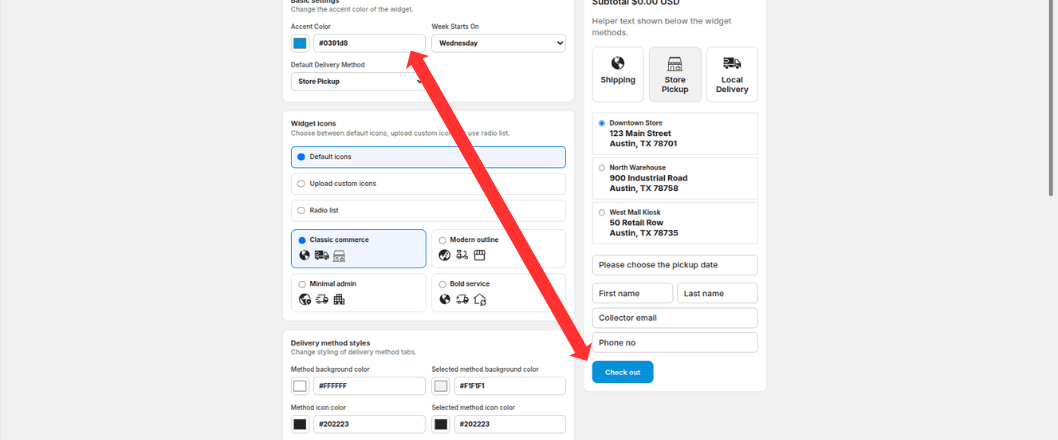
Accent color applies to the checkout button and other accent elements in the widget
Widget icons
Choose default or custom icons for pickup, delivery, and shipping in active and inactive states.
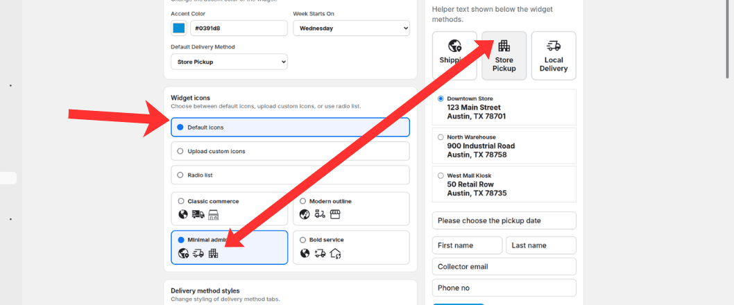
Choose default icons, upload custom icons, or pick an icon preset for shipping, pickup, and delivery
Delivery method styles
Customize background, text, icon, and border colors for selected and unselected fulfillment method buttons.
Set the method button font size and the display order of shipping, pickup, and local delivery.
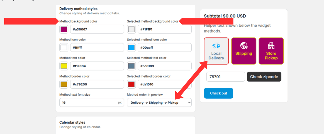
Style selected and unselected method tabs, set font size, and choose method display order
Calendar styles
Customize calendar background, text, selected date colors, and border colors.
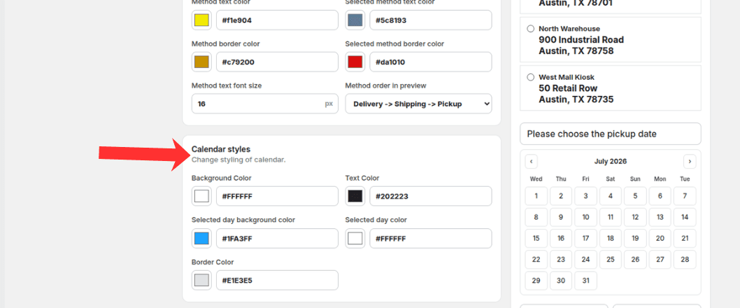
Customize calendar background, text, selected day, and border colors
Input field styles
Set input background, text, border colors, and font size for form fields in the widget.
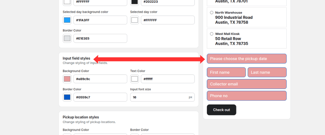
Customize input background, text, border colors, and font size
Pickup location styles
Customize pickup location list background, border, active state, name color, and address styling.
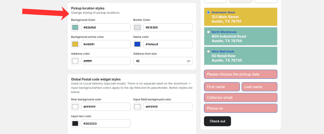
Style pickup location background, border, active state, name, and address colors
Global postal code widget styles
Style the postal code lookup section: label, background, input, and button colors and font sizes.
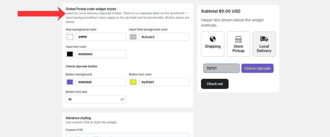
Style the zipcode input and Check zipcode button for local delivery
Advanced CSS
Add custom CSS for fine-grained control over widget appearance beyond the built-in style fields.
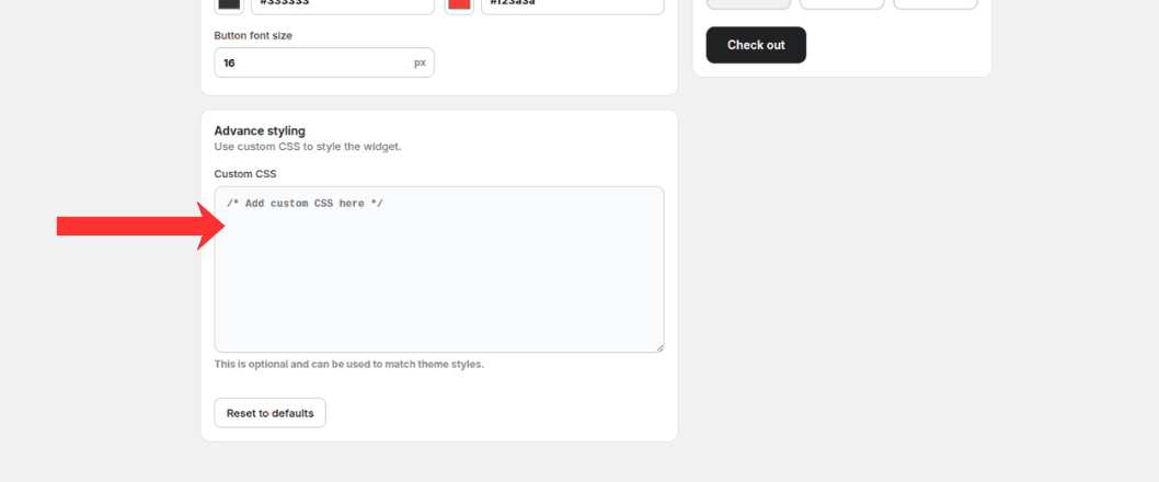
Add optional custom CSS to match your theme styles
Click Save to publish design changes to your storefront.
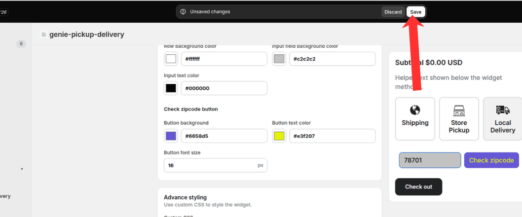
Click Save to publish your widget design changes
What's Next